Check back soon
Once posts are published, you’ll see them here.


We’re up dating our tactical trading strategy through the end of the year. Allow us to preface this post by stating we are giving the bull market the benefit of the doubt and continue to consider the market in an uptrend. We haven’t seen anything economically, fundamentally or technically to make us believe we are on the cusp of an economic recession or a major market top and pursuant bear market. While some of our indicators are concerning, we are keeping our bullish bias in place. We’ll have more on that in a later post.
Tactically we are turning near-term bearish on the market and believe we could see a correction over the next few weeks/months that should offer a buying opportunity as we close the year. There are a few red flags that we should note.
Red Flag #1: Defensive Sector Rotation
The recent breakout of the bullish cup-and-handle pattern on the SPX near 2800 has propelled the market higher and we were able to profit from the move (see Fear of Missing Out (FOMO)). What we don’t like to see is the market rally led by defensive sectors. The graph below shows the best performing sectors over the past two months have been Consumer Staples (+11.7%), Utilities (+11.3%) and Health Care (+10.0%).

On the Relative Rotation Graph, we find Utilities, Real Estate (REITS) and Health Care in the sweet spot while Consumer Staples ranks high in the improving category heading into a leadership role. Consumer Discretionary, Technology and Energy are losing momentum rapidly while Materials, Industrials and Financials remain in the dog house.


When comparing the S&P 500 Growth Index relative to the S&P 500 Value Index, we see dramatic out-performance for value names.

Our Cyclical vs. Defensive ratio confirms the pattern.

Dan Russo made a few observations in See It Market. He writes, “The FAANG (Facebook, Amazon, Apple, Netflix & Google) stocks are the market generals and their performance is likely to have a big impact on the overall direction it takes. The group (based on a custom index which we built) is fading from resistance at the recent highs as FB and NFLX have, once again, come under pressure. AMZN and GOOGL are consolidating and AAPL has broken to new highs. Momentum remains in bullish ranges, based on the RSI, and has not become oversold since November 2016. One development we are watching is the series of lower highs in the RSI indicator which have not confirmed the price highs.”

Speaking of sector leadership, he points out, “The ratio of Consumer Discretionary stocks to Consumer Staples stocks is, again, testing support at the key breakout level (dashed line) just above the rising 200-day moving average. The RSI has not been able to register an oversold reading during the pullback but is having trouble moving back to bullish ranges. The benefit of the doubt remains with Discretionary for now, but a break of support would have negative implications for the ratio.”

Semiconductors have been taking a beating. Usually not a great sign as the market tries to rally to new highs. “Semiconductors are on the verge of breaking support relative to the S&P 500 (and the news from NVDA and AMAT last night will not help). The ratio also remains below the 200-day moving average. The RSI has marked a series of lower highs and failed to become overbought during the latest move higher. A break of support would be concerning to us and further deterioration could be a negative for the market.”

From Willie Delwiche in See It Market, “Our look at longer-term breadth trends is usually through the lens of the percentage of industry groups in up-trends. That indicator improved as the S&P 500 moved off its early year lows, but has stalled more recently and not made a new high in the past two months.”

“While longer-term breadth trends have been somewhat stable, shorter-term trends are seeing some deterioration. Our sector-level trend model looks at shorter-term (65-day) price, momentum, and breadth trends for the S&P 500 sectors. After making a series of higher lows and higher highs since bottoming in early April, this indicator has begun to struggle. The most recent high on the S&P 500 accompanied by a lower high from our sector-level trend indicator and that has been followed by a break below the rising trend line. Weakening in sector-level trends suggests the S&P 500 may be losing some internal support that has helped carry the index to within a few percentage points of its January peak.”

According to Brad Zigler at WeathManagement.com, “If this was just some routine summertime congestion, we wouldn’t be too concerned. What we’re seeing, however, is waning vigor in the market-leading large stocks. That’s worrisome. Our breadth ratio has been slipping and is now challenging the lows set in January 2016. Evidence of that can be seen in the chart below which contrasts the breadth ratio to the market-tracking SPDR S&P 500 ETF (NYSE Arca: SPY). Declining breadth typically accompanies or precedes bearish market phases.”

Red Flag #2: “Risk-Off” Securities are Moving Higher
Looking at the chart below, we find traditional risk-off instruments trending higher. The Japanese Yen, 10Y Treasury Notes and Utilities are all trading above their 20-day EMA. The exception is Gold, which is trading lower as the US Dollar has strengthened against most developed and emerging markets.

It seems Gold has lost its standing as a flight to quality type of safe-haven instrument but there could be a rally coming in the coming weeks and months. The following tweet from Peter Boockvar definitely raised my eyebrow.

Cam Hui from Humble Student of the Markets writes about a possible rally in Gold. He points out, “As the chart below shows, the recent weakness in gold prices can largely be attributed to USD strength (green line, inverted). One constructive element for the gold price outlook is the positive RSI divergence as the price tests support.”

“Sentiment also appears to be washed out. The latest update of CoT data from Hedgopia shows that the positions of large speculators, or hedge funds, in gold futures are at or near capitulation levels.”

“Moreover, gold prices have been lagging as inflation expectations have risen. Even as gold violated an uptrend line, inflation expectations in the credit markets have been steadily rising.”
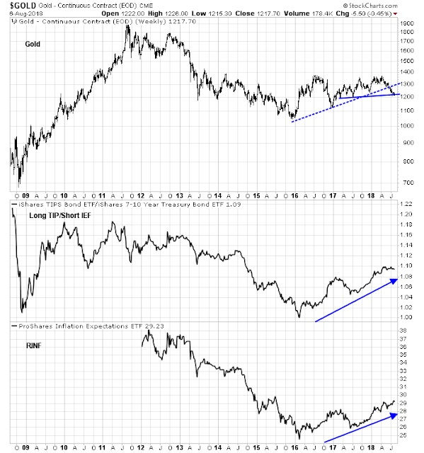
We too have reservations about the problems that inflation can cause to the current bull market. We outlined our concerns a few weeks ago in our post Inflationary Concerns and a Bear Market.
Cam also brought up seasonality for Gold. “Another factor supportive of gold is seasonality. If history is any guide, August and September tends to see an above average probability of higher gold prices.”

We have watched low beta stocks perform well relative to high beta stocks. As the market moved to new highs, the high/low beta stock ratio has been range-bound. A break in either direction will be telling. Should the ratio break support near .870, then we believe our thesis for near-term weakness will be confirmed.

The Japanese Yen is usually considered a risk-off trade as well. Recent note on the currency confirm that a new rally may occur and that would confirm our near-term thesis for market weakness. T. Pizzuti & K. Hulse in See It Market writes, “On the weekly chart below, we have emphasized the primary (triangle) scenario, but both the primary and alternate call for an upward move that should look corrective and will probably consist of three sub-waves.”

“Nearby resistance levels to watch include 86.37 and 87.26 based on retracement increments. A support level that is roughly in line with the expected lower boundary of the triangle sits at 85.49.
In both the primary and alternate scenarios, the upward retrace should find resistance if it tests the area near 89.87, and it should not exceed the level of the earlier high, marked as wave (c), at 91.62.
Eventually price should break downward to reach beneath the 2015 low, and we have identified 74.79 as a preliminary support area”.
For the Utilities Sector, there has been a lot of upward momentum that has been confirmed by internals. The only negative thing on the chart below is the bearish divergences between the RSI (14) and MACD compared to prices. Other than that, it looks like the Utilities Sector could breakout to new highs.

Red Flag #3: Cluster of Hindenburg Omens
Citing research found in The Felder Report, “Technically, for a Hindenburg Omen to be triggered it requires the index to have a positive 50-day rate of change and the number of new highs and lows both surpass 2.8% of all issues within it. When we see a growing number of these signals triggered it points to a consistent rise of inconsistency within the individual components of the index, a sign that longer-term breadth is waning.
Over the past 20 years there have only been a handful of occasions when we have seen the Nasdaq trigger so many Hindenburg Omens in a short period of time. In fact, there have only been three separate occasions when the index triggered 8 signals in less than four week’s time. After each of these the index suffered a correction if not a full blown bear market. At 5 currently we’re obviously not there yet but this may be something worth keeping an eye on as 5 was enough for the top in March of 2000.”

“What’s more, if we look at the number of signals triggered on both the Nasdaq and the NYSE over the past year we are just coming off the largest cluster since the 2007 peak. The current reading (26) is also greater than that seen at the March, 2000 top (20). Of course, the signal in 2015 did not lead to a major market peak as did the prior two signals. However, that doesn’t diminish this indicator’s value as a warning signal – the 2015-2016 market experience was still the most painful in several years.”

Definitely a warning sign that confirms our tactical thesis that could certainly turn into something much more severe than a mild correction. We’ll keep an eye on it.
Red Flag #4: Strength of the US Dollar
Given the heightened volatility within emerging markets and our own monetary policy, the US dollar has been trending higher of late. President Trump’s criticism of Fed policy has weakened the US dollar this morning but overall, the trend is higher this year. Cam Hui of Humble Student of the Markets points out, “On the other hand, much depends on the fate of the USD. The historical evidence over the last 12 years shows that whenever the one-year change in the USD Index exceeds 5%, stock prices have struggled, Notwithstanding the fears caused by the Turkish Tantrum, a rising USD puts downward pressure on the Chinese yuan, and raises the risk of American accusations that China is devaluing its currency in response to tariffs. Even if the Dollar were to stabilize at these levels, the base effects of a falling exchange rate last August and September means that the one-year rate of change could easily exceed 5% in the next few weeks, which represents a danger signal for equity prices.”

“However, the USD Index doesn’t tell the entire story of currency strength. While the USD has been strong overall, its strength can be especially seen against EM currencies.”

Red Flag #5: Deteriorating Market Internals
On the following chart we point out the bearish divergences between the S&P 500 (hitting new highs) and the RSI (14) and MACD. The SPX rally is not confirmed by these measures and appears to be a weak rally from here.
Also, the percentage of companies in a bullish P&F pattern and the percent of companies trading above their 50 and 200-day SMA’s are not confirming this rally.

From Stockcharts.com, “Chart 1, for instance, shows that the S&P came within a whisper of its old high, yet the KST was lower and could not even bear its June high, and has now started to edge lower. There is a small gap above Friday's trading, which may need to be filled before prices react to the general weakness I see elsewhere.”
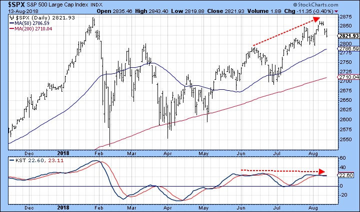
“Throughout the rally dating from mid-March, we saw the NYSE A/D and common stock A/D line try to lead the market higher. This is normally a good thing, as we want to see these breadth indicators succeed in this respect. If they do not and prices head lower, that's also a bad outcome, similar to when the breadth indicators fail to respond to a higher reading in the market averages themselves. Both represent disagreements, which when confirmed, usually lead to trouble. That may be the case now, because Chart 2 shows that both breadth series are starting to break their April/August up trend lines.”

“Chart 3, compares the NYSE Composite to the Common Stock Only McClellan Oscillator. The red shaded areas flag when the oscillator is below its 20-day MA. That doesn't always translate into lower prices, but it does indicate that fewer stocks are participating in any rally, thereby making it more challenging to select a profitable trade. This indicator went bearish in June and has been falling ever since. Note that the latest recovery high, flagged by the dashed arrow, failed to be confirmed by the oscillator. That's not a good sign.”

“The same comment can be made about the NASDAQ and its bullish percentage indicator. That's because it recently failed to confirm the all-time-high set by the NASDAQ Composite. That indicator remains below its 20-day MA and has just violated its 2018 up trend line, all of which suggests that the market and the number of NASDAQ stocks in a bullish trend are vulnerable.”

Also from Stockcharts.com, “The SPX and OEX have similar features to their charts so I'll talk about them first. The first thing that I noted visually was the possible head and shoulders pattern that could be developing on both indexes. This is very early in the formation stage...the right shoulder hasn't really formed until Friday's intraday high becomes a short-term top and the neckline is actually penetrated. It still caught my eye and I wanted to note it as a possible short-term bearish set-up in the making.”


“Talking about bearish set-ups, the NDX is forming a near textbook double-top. We have the two tops, now we wait for the confirmation line to be broken at around 7150. Should this double-top execute, the minimum downside target would be 6800. Note the NDX's PMO hasn't really decelerated since its SELL signal.”

“The Dow has formed a volatile broadening pattern. These are typically bearish in nature and will resolve to the downside.”

Red Flag #6: Mid-term Elections
From Jeff Hirsch of Almanac Trader, “Midterm years are notoriously a rough year for markets as presidents push through their most disruptive policy initiatives and battle the opposition party to retain congressional seats.”
He goes on to say that the last few mid-term election years haven’t performed that badly and thinks this year could be spared from a major sell-off. We are still quite cautious on the political front and believe fireworks out of Washington could have a marginal adverse effect on the rally. The chart below shows how the market has reacted in the past few mid-term election cycles. The red line that represents the average stock market performance over the course of a mid-term election year. Notice the weakness in September and October followed by nice moves higher into the end of the year.

Willie Delwiche in See It Market writes, “A recent study by Ned Davis Research shows that the S&P 500 has experienced a median peak-to-trough pullback of 9% in the second half of mid-term election years. Recession-related years have seen pullbacks of more than twice that amount, while mid-term election years that have been relatively quiet from an external catalyst perspective have seen pullbacks of half that amount.
We see little evidence of domestic recession but also a global macro environment that has plenty of potential catalysts that could trigger a pullback. While price has been resilient, risks are high in the face of a deteriorating global backdrop.”
Red Flag #7: Yield Spreads
When looking at the yield differential between Investment Grade bonds vs. High Yield Bonds, we find an inverse relationship between the spread and the movement in the S&P 500. The chart below shows that the yield spread is starting to rise off the lows set at the start of the year and that does not bode well for equity prices.

Also, the recent rally in equities hasn’t stopped investors from gravitating towards safe-haven treasuries. The ratio of the S&P 500 vs. iShares Barclays 20+ Year Treasury Bond (ETF) is not confirming the current rally.

Our strategic thesis remains intact. We are bullish and will continue to remain bullish until proven otherwise. We believe the path of least resistance is higher for the US equity market given our economic, fundamental and technical outlook. That said, our tactical position is pointing towards near-term market weakness.
We will be taking profits and raising cash in the portfolio over the next few weeks as we fade the current rally. We will shorten our stops and seek to introduce hedges against our core positions. We will seek to increase our exposure in positions that will benefit from increased market volatility and downside momentum.
We expect that the end of October into early November will offer exceptional buying opportunities as the year closes. If we are wrong in our assessment, the S&P 500 will thrust through to a new all-time high on robust volume once everyone comes back from summer vacations. If that were to happen we will reestablish our positions and attempt to profit on the way up. Our stance currently is that protecting our gains for the year and preparing for a downside move in the market offers a better risk/reward dynamic than betting on a continuation of the rally through the end of the year.
Joseph S. Kalinowski, CFA
Comments