Check back soon
Once posts are published, you’ll see them here.


When speaking of our tactical strategy, we allude to our shorter-term plan of action (one to three months) within our longer-term plan of action (one to three years). When crafting our tactical strategy, our thesis revolves around our proprietary behavioral model.
Our Behavioral Indicator attempts to capture human trading emotions mathematically. It combines years of data from various indicators and aggregates it into an easy to understand model that assists in the investment decision making process. Our indicator encapsulates the put/call ratio, the volatility index, pricing and volume analysis, new high/lows and point and figure analysis to report the daily scores used in making decisions.
Our indicator will score within one of five basic Market Cycles. These cycles include “Extreme Euphoria”, “Greed”, Rational Market”, “Fear”, and “Extreme Panic”. Depending on where we are in the market cycle determines how aggressive our portfolio structure. Typically, the best time to aggressively buy US equities is when we are rising out of Extreme Panic. The best time to be conservative is when we are falling from Extreme Euphoria.

Delving further in the interpretation, our models comprise of two lines. The first is the “Trigger Line”. This line tracks the general movements of the market and provides us with a “heads up” that a time to act is approaching. The second line is the “Trend Line” and provides us with the actual actionable entry or exit into the market.
The trigger line bottomed in the extreme panic zone and started higher on October 4th this year. The trend line turned higher soon after and we decided to increase our long exposure aggressively on October 12th.
While the strategy worked well for us in the month of October, we overstayed our "risk on" position when in early November the trigger line started lower. By November 14th the trend line was headed lower and an investor should have decreased his long bias in favor of a more defensive stance.
On December 6th, the trend line started higher once again.
We continue to have a long bias in place but are becoming increasing cautious in the near-term. Based on our behavioral model, the trigger line has entered the “Greed” zone. While not a major reason for alarm, we are ever watchful for a sense of complacency in the market that may offer a pull-back from the markets lofty northward journey.
Bottom Line: We believe the US equity markets will continue to move higher through late January / early February and we continue to deploy a bullish portfolio framework. Once the trend line in the behavioral model slopes negatively, we will take profits and assume a more defensive stance.
Tracking Complacency
There is one item that we would like to highlight this week as part of our dissection of our behavioral theories. We deliberately use certain sentiment indicators to assist us in determining market direction. In our attempt to capture “complacency and skittishness” we use the put/call ratio.
Put/Call Ratio
The put/call ratio is the comparison of put volume relative to call volume. For those unfamiliar with how put and call options work, put options are derivative securities that move in the opposite direction of its underlying asset. For instance, if one were to purchase a put option against the S&P 500, if the index went lower, the put option would appreciate. Put options are generally used to hedge against market weakness or bet on a decline. Call options are just the opposite. Unlike put options that have an inverse relationship with its underlying asset, call options have a direct relationship with the underlying. Call options are used to hedge against market strength or bet on advance. A put/call ratio above 1 signifies put volume exceeding call volume. When the ratio is below 1, then call volume is greater than put volume.

The theory goes is that when the put/call ratio is registering high numbers (in excess of 1.0), market sentiment is deemed bearish. If this ratio stays elevated for a period of time, one would look for clues of an oversold “skittish” market and would consider buying stocks. Conversely, when the ratio is nearing excessively low levels for a period of time, one would determine the market as too “complacent” and look to exit.
How We Use the Put/Call Ratio
The put/call ratio is an indicator that should be used to provide contrarian alerts indicating extreme bullish and bearish cycles. Being a contrarian can be a lonely task at times simply because a contrarian investor is always going against the majority.
Extreme Spikes
The put/call ratio can be used to identify spike extremes that may foreshadow a market reversal. A spike extreme occurs when the indicator spikes above or below a certain threshold. Figure 5 shows the indicator with horizontal lines at 1.42 (green) and .61 (red). A spike above 1.42 is three standard deviations from the average and reflects a surge in put volume relative to call volume, which could be interpreted as excessive bearishness. As a contrarian indicator, excessive bearishness is viewed as bullish.
Typically, when an investor witnesses a sharp spike in the ratio, it can be interpreted that the market bottom is nearing from a recent market correction. As can be found in Figure 5, the ratio produced sharp upward spikes in September, October and November of 2008. The market did move higher from that point only to be retested in early 2009. Once that bottom took hold, the market went on to produce significant returns.
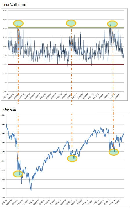
The model also produced extreme spikes in May 2010. The market ended up bottoming in June/July of that year before continuing its upward ascent.
The ratio offered extreme spikes in August and September of 2011. The bottom was reached in October of that year.
While looking for extreme spikes is one method of interpretation, it does have its drawbacks in that it provides very early signals and ofttimes the market continues lower from the spike point. While having an early warning system in place is beneficial for investors, we went further in our modeling and created our probability bands for the ratio.
Probability Bands
The thick orange line in figure 7 represents the fifteen day moving average of the normal distribution for the ratio. The line will stay in-between +1.0 and -1.0 for 68.27% of the observations. Our model dates back to 1997 or four thousand one hundred and seven trading days (4107) and updated daily. When this line ventures outside that probability zone is when money can be made in the market. The trick is to use this model in conjunction with extreme spikes to further enhance one’s ability to use this formula for profits.
Going back to our previous market entry examples, we already established where the spikes occurred. Using Figure 7, the next step would be to use this model to pinpoint a more precise entry point. Typically one wants to aggressively buy stocks when the thick orange line pierces the -1.0 probability band to the upside. Our buy points are now pushed out to Late December 2008 / early January 2009, Early July 2010 and early December 2011. As can be seen in figure 8, using the two models in conjunction will harmonize the investment decision-making process.

Skewness
According to mathworldwolfram.com, “Skewness is a measure of the degree of asymmetry of a distribution. If the left tail (tail at small end of the distribution) is more pronounced than the right tail (tail at the large end of the distribution), the function is said to have negative skewness. If the reverse is true, it has positive skewness. If the two are equal, it has zero skewness.”
The put/call ratio has a slight rightward skewness, meaning that its downside swings are more volatile than its upward swings. Figure 9 shows what a normal distribution bell curve looks like. Figure 10 is what the bell curve will look like for the put/call ratio.

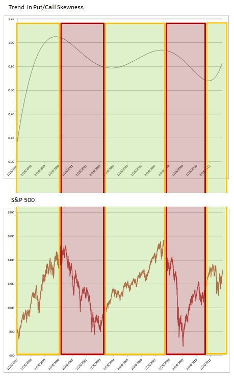
While there are methods such as Box-Cox Transformation to attempt to reduce skewness, we choose instead to monitor changes in skewness. Historically, skewness is greater than zero and less than one, so skewness is not a major factor in our forecasting. We found that tracking skewness on a rolling 360 day period offers directional insight.
Figure 11 tracks the skewness of the put/call ratio over the past seventeen years and is expressed as a sextic polynomial for the purpose of trend spotting. As one can see, the direction of the line offers insight as to the secular trend of the S&P 500.
By using these put/call variables and incorporating the results into our overall behavioral model, we have a clear advantage in capturing directional market moves over those that merely “trade on instinct”.
Bottom Line: Our strong performance in January is a direct result of interpreting the results provided by our various models and using the appropriate investment instruments to execute our tactical plan. We will let our profits run until our behavioral model, which includes the put/call analysis turns southward. We will be taking profits and de-levering when that moment arrives.
Joseph S. Kalinowski, CFA
Comments