Check back soon
Once posts are published, you’ll see them here.


In last week’s notes, we outlined the extreme sentiment that has propelled the market higher (Market Sentiment Gaining Momentum) and mentioned several reasons why we believe the market could go higher from here (Investment Thesis for 2017).
The problem we now face is deploying new assets at the appropriate levels. At this time, we are not chasing the market during the latest advance and will wait for a pull-back / correction. The chart below is the S&P 500 on a daily basis. There is a clear upward channel that started about a year ago and we are testing the upper boundary currently. All of the oscillators that we track (RSI 5 and 14 as well as Stochastics) for the index are not confirming the recent highs and are showing a bit of a bearish divergence.
Volume on the latest upward move is declining and the bearish MACD cross remains intact. Companies in the index that are trading above their 50 and 200-day moving averages are diverging from price action as well. This ties in with the S&P 500 equal weight ETF that has flatlined as the general index accelerated.
The percent of companies in the index exhibiting bullish P&F patterns has topped out and new highs vs. new lows barely moved the needle on Friday’s rally.

This points to waning participation and may be setting up for a pullback that could offer a better market entry for those wishing to allocate new assets.
Additional clues come from a recent report through StockCharts.com. They write, “The chart below shows the S&P 500 SPDR (SPY) with three breadth indicators for the S&P 1500: the 10-day EMA of AD% ($SUPADP), High-Low%($SUPHLP) and %Above 200-day EMA (@GT200SUP). The latter (@GT200SUP) is a user-defined index created using data from !GT200SPX, !GT200MID and !GT200SML. You can read more about these indicators in these three articles: AD Percent, High-Low Percent, and %Above 200-day EMA. The indicators have been net bullish since March 31st (2 of 3 with bull signals).”

“First and foremost, these breadth indicators triggered bullish signals in March and remain bullish overall. Despite a bullish market environment, I am seeing signs of less strength as the market pushes to new highs. The S&P 500 SPDR and S&P MidCap SPDR moved to new highs this week, but the S&P SmallCap iShares remains just short of a new high. New highs in two of these three is clearly more bullish than bearish. Even so, the 10-day EMA of AD Percent has yet to clear +20% this year and High-Low Percent has yet to clear +15%. This is not outright bearish, but it does point to less participation on the last push higher. The %Above 200-day EMA remains strong and well above 70%. A move below 70% could signal the start of a correction within this bull market.”
Looking at the chart below, the VIX is near extreme lows. This usually correlates fairly closely to a weakening or stagnant market.

IF we were to see the market pullback or correct from here there are a few key levels to watch for. Again from StockCharts.com, “Timing or predicting a pullback within a bigger uptrend is tricky business because the uptrend is the dominant force. Ideally, I prefer to wait for pullbacks and use these as opportunities to partake in the bigger uptrend. We can expect 2 to 4 decent pullbacks (5-10%) in any given year. Just because the market is due for a pullback, however, does not mean it will happen. We will get a pullback at some point, I just don't know when (nobody does!).
The chart below shows the S&P 500 with the 5% Zigzag as the blue dotted line. The last 5+ percent pullback, on a closing basis, was in June. The August-November pullback was just short of 5%, but still a decent correction. Thus, it has not been that long since a correction. Should we get a 5% pullback from current levels, the S&P 500 would correct to the 2185 area. This would mark a 50-61.38% retracement of the November-January advance and a return to broken resistance. This is the area to watch if/when we do get a pullback.”

On the weekly S&P 500 chart it appears obvious that the uptrend remains intact but extended somewhat. We’re seeing breadth falling short of pricing action similar to the daily chart. Other key levels to watch are 2150 (bottom of the upward channel); 2140 (50-week moving average); 2135 (roughly the breakout level from two years of consolidation) and 2120 (which is the 38.2% Fibonacci retracement from the February 2016 lows).
We discussed last week why we believed the economy would avoid a recession and the bull market would continue in 2017 so we are comfortable buying the dip near these entry points should they occur. These figures would represent a 5% to 8% pullback.

Additional insight on market support levels comes from Lance Roberts at Real Investment Advice. He notes, “A “buyable correction” would suggest a correction back to recent support levels that keep the overall “bullish trend” intact.
The chart below shows the recent advance of the market has gotten to extremely overbought conditions on a short-term basis and the ‘sell signal’ noted at the top of the chart, combined with the extreme overbought condition at the bottom, suggest a potential correction could take the market back to 2200. Also, note the negative divergence of the PMO oscillator despite the advance in the market.
While such a correction would be relatively minor in the short-term, it would also violate the bullish uptrend that has held since the 2016 lows.
However, putting this into an actual loss perspective, the following chart details specific support levels back to the psychological level of 2000. A violation of the 2000 level and we are going to start discussing the potential for a more severe market correction.”

“A violation of initial support level sets up corrections of 4.9%, 6.6%, 8.6% and 13.2% from the recent highs. With bullishness running at highs, and cash allocations at lows, the risk of a short-term reversal is high.”
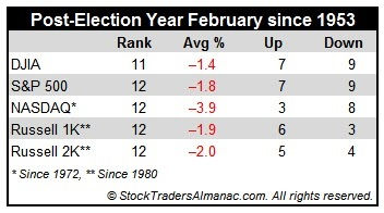
There is a little bit of history that supports our February lull. According to Almanac Trader, February is usually the worst performing month for the market post-election years. They write, “February’s post-election year performance since 1950 is miserable, ranking dead last for S&P 500, NASDAQ, Russell 1000 and Russell 2000.
Average losses have been sizable: -1.8%, -3.9%, -1.9%, and -2.0% respectively. February is eleventh for DJIA with an average loss of 1.4%. February 2001 and 2009 were exceptionally brutal.”
Also from Almanac Trader, “In the [below] chart, the average S&P 500 performance during new presidents first 100 days in office is plotted. Only Democrats, only Republicans, both parties and the Trump administrations (through today’s close) are compared.
At the end of the first 100 days, new Democrats were accompanied by the greatest average S&P 500 gains. However, regardless of party, S&P 500 did reach an early February peak before moving lower through the balance of the month. S&P 500 performance during President Trump’s first week in office has been above average when compared to past Republican administrations, but is still lagging new Democrats.” [emphasis added]

Bottom Line: Our bullish thesis remains intact. We are expecting a pullback in the market over the next several days and weeks in which we will be deploying new assets in the US equity markets.
Joseph S. Kalinowski, CFA
Comments