Check back soon
Once posts are published, you’ll see them here.


Yield Curve Inversion
We wanted to touch upon the flattening yield curve and its implications for US equity markets. As of the time of this writing the yield curve differential between the ten and two-year treasury yield is only 30 basis points. This is important because when the yield curve differential inverts, it usually marks the start of a US economic recession and a bear market for stocks. In fact, an inverted spread between the long and short ends of the yield curve have preceded the last seven economic recessions in the US.

With the Fed on a mission to normalize rates, increasing the Fed Funds target from near zero in 2015 to now almost 2%, the two-year treasury yield has risen to 2.67% while the ten-year has remained stubbornly below 3% - now 2.97%.
The Fed usually embarks on tightening monetary policy conditions during times of an economic boom to ward-off the undesirable effects of inflation. This in turn negatively impacts credit markets leading to a “credit crunch” that filters through the economy.
A recent article by Ambrose Evans-Pritchard from The Telegraph (via Mauldin Economics) exposes additional concerns with our current path of Monetary Policy. He writes, “The forward curve for the one-month Overnight Index Swap rate (OIS), which is a market proxy for the Fed policy rate, has flattened and inverted two years ahead. Ambrose notes that Fed officials like to rely on a different signal: the point where the 10-year US Treasury yield drops below the two-year yield. Problem is, this tends to happen several months after the OIS rate curve has already inverted. By then it’s often too late.
The Fed’s tightening is putting the squeeze on the money supply.
On the global front US rate rises are in effect being magnified, through the mechanism of LIBOR (the London Interbank Offered Rate). Three-month LIBOR – used to set the cost of borrowing on $9 trillion of US and global loans, and $200 trillion of derivatives – has surged 60 basis points since January, and the LIBOR-OIS spread (or LOIS) has widened. The last time that happened – to disastrous effect – was 2007.”
This Time is Different
According to recent comments from the Fed, it would appear that the potential yield curve inversion shouldn’t be given the same consideration as in the past as this economic cycle is unique in nature and other indicators should be used in its place. The Fed states that recent bond purchases (QE) by the Fed, the ECB and the BoJ to stimulate global economic growth have depressed yields on the longer spectrum of the curve. Additionally, the term premium that investors demand for holding longer dated instruments has been negative in recent years further skewing the accuracy of the yield curve differential driving rates higher on the shorter end of the spectrum.
Equally important to US yields is the zero to negative interest rate policies of our global economic partners, i.e. Europe and Japan. Their ten-year yields have fallen to levels near zero, so given a choice, investors that are mandated to invest in sovereign debt have a very clear choice on where to put their money. Currently, the US 10Y is yielding 2.97% vs. 0.44% and 0.03% for Germany and Japan, respectively. This would put additional downward pressure on the long end of the US yield curve.

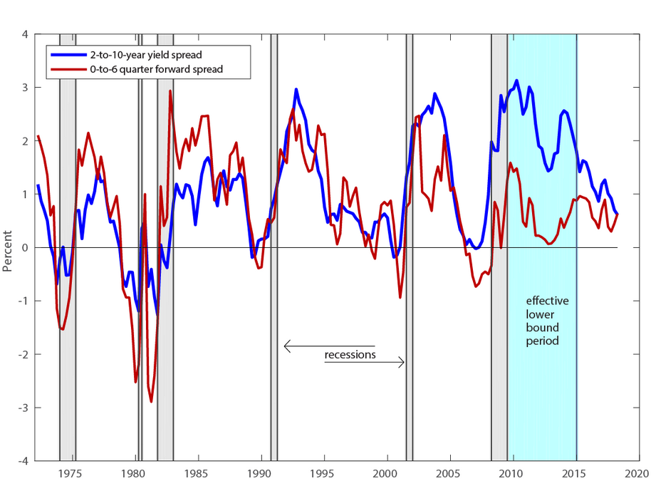
The Fed has taken these variables into consideration and through research produced by their in-house economists have offered an alternate view of how investors should be using the yield differential to determine economic health. They proclaim that comparing the difference between the yields on shorter-term treasuries to that of the yield implied by the futures market about a year and a half into the future, offers a cleaner message to the market on the strength of the economy.
Stephen Williamson on the New Monetarist Economics blog makes the case that the current yield curve doesn’t appropriately measure economic health. In it he writes, “But there are a couple of episodes in the sample, in 1996 and 1998, when the yield curve is pretty flat, but there's no ensuing recession. What's different about those two episodes is that the compression is caused more by long bond yields moving down, rather than the short rate moving up, as we observe in the cases where compression precedes a recession. If you were worried about an oncoming recession right now, based only on yield curve observations, you shouldn't be. All the recent flattening in the yield curve is in the long end. The margin between the two-year yield and the three-month T-bill rate hasn't been falling, as it did prior to previous recessions.”
“Recessions tend to happen when the short rate goes up a lot, and that's driven by monetary policy.”
“Typically, when the real interest rate moves from trough to peak by a large amount, a recession happens. That seems to work pretty well, except during the 1980s disinflation. So, for example, from trough to peak, the real rate moves about 420 basis points before the 2001 recession, and about 400 basis points before the 2008-09 recession. Recently, the movement from the trough to where we are now is about 200 basis points, so by that criterion, it's not time to worry yet.”
Indeed, the long end of the curve could certainly be depressed due to holdings by the Fed. According to an article in Bloomberg, “It comes down to the central bank’s other monetary policy tool: its balance sheet. Part of the Fed’s normalization process involves letting its debt holdings mature and only reinvesting the proceeds if they exceed monthly caps, currently at $24 billion for Treasuries and $16 billion for mortgage-backed securities. Some investors have speculated that this runoff would reintroduce term premium into the market. That’s not happening.
Why not? Well, for one thing, the Fed is still buying a good chunk of Treasuries. In May, it gobbled up $4.1 billion of 30-year bonds, or about 20 percent of the $21.1 billion total issued by the Treasury.”
“Imagine if asset managers, foreign investors, individuals, pension funds and primary dealers had to absorb that much more long-duration debt. They’d certainly demand a larger premium, which would steepen the yield curve and swiftly solve Powell’s conundrum.
And it’s not just new purchases. Take a look through the Fed’s holdings, and you’ll see that the central bank holds more than half (and as much as 70 percent) of some Treasury bonds that mature from 2037 to 2042. That’s almost half a trillion dollars of firepower that officials are choosing not to deploy to steepen the yield curve. If they really wanted to, they could effectively carry out a reverse Operation Twist by selling those long bonds and purchasing shorter-dated maturities.”

This revelation doesn’t come without its fair share of critics.
We came across a great article in Real Investment Advice entitled The Mendoza Line: Is The Fed’s New “Yield Curve” Professional Grade?
In the article they write, “Interestingly, the Federal Reserve (Fed) recently introduced the merits of a new yield curve formula to supplement the traditional curve and better help forecast recession risks. Might it be possible the Fed has brought this new curve to the market’s attention as it does not like the message the traditional curve is sending? Given that the Fed Funds rate remains very low despite recent increases, is it possible the Fed is desperately attempting to increase the monetary ammo available for the next recession?”
“The yield on the UST 10 not only reflects the supply and demand for ten-year government debt securities but importantly embedded in its yield are investors’ expectations for inflation and growth. These expectations are influenced to some degree by the Fed’s monetary policy stance.
The UST 2, on the other hand, is much more heavily influenced by the Fed Funds rate set by policy-makers and less so by long-term growth and inflation expectations.
Therefore, the UST 10 provides information about how borrowers and lenders view future economic activity and inflation, while the UST 2 affords us insight into how the Fed might change interest rates in the future. It is this intersection of the Fed’s interest rate policy and the heavy reliance on debt to fuel economic activity that makes the 2s/10s yield curve an especially compelling indicator today.”
“The difference between how investors price UST 2 versus UST 10 help us contrast expectations for economic growth/inflation and monetary policy. When the curve inverts, the market is warning us that the Fed’s monetary policy is restrictive or in market terms, tight or hawkish. In such an environment banks are not very willing to lend as their cost of borrowing does not provide enough profit margin to cover credit losses and meet profit thresholds. Conversely, when the curve spread is wide and monetary policy is deemed easy or dovish, banks are in a much better position to extend credit.”

When speaking about the new yield curve methodology proposed by the Fed they write, “This curve is calculated by comparing the current three-month rate for Treasuries versus what that rate is expected to be six quarters from now. The forward rate is calculated using the current rate and the interpolated rate on 1.50- and 1.75-year Treasury notes…Said differently, the Fed imposes unnatural control over the shape of the new curve. Consider again the correlation table above. For Treasury securities with two years to maturity or less, expected Fed policy has a strong influence on yield. Therefore, by saying they intend to hike interest rates, the Fed also influences the shape of their new yield curve metric. The logic behind the new curve logic confounds what they claim is a pure insight into expectations for a recession.”
The following chart shows the new yield spread methodology in action and was provided in a recent Federal Reserve Board Research note that we’re including here via Wolf Street.

“The note included the chart below that compares the “long-term spread model” (the yield curve, blue line) to the new “near-term spread model” (red line). It shows that the new model accurately predicted the last five recessions, similar to, but perhaps slightly better than, the yield curve. This occurs when the lines drop toward and below zero. The chart also shows that the spread of the new model is well within range of the past few years and pointing in the right direction (up), while the spread of the long-term yield curve is at the lowest point in 10 years and seriously pointing in the wrong direction.”
“To convert this into an indication of recession probability expressed in percent, as the market sees it, the Fed economists offer the chart below”

“It shows how the yield curve (blue line) is indicating a rising probability of a recession – while, according to the new indicator, “the market is putting fairly low odds” on this scenario.
So just in the nick of time, with the spread between the two-year and the 10-year yields approaching zero, the Fed begins the process of throwing out that indicator and replacing it with a new indicator it came up with that doesn’t suffer from these distortions.”
Inflation Concerns
Chairman Powell stated earlier in the year (via WSJ) that inverted yield curves preceded economic recessions because “inflation was allowed to get out of control, and the Fed had to tighten, and that put the economy into recession”. He later stated that this wasn’t the situation that they currently faced.
It is quite profound, in our opinion that Chairman Powell believes that the Fed has that much power over general market forces to control inflationary pressures. What if inflation started to rear its ugly head? The Fed would then be forced to aggressively raise rates, and given where the yield curve currently sits, it would surely invert under this scenario.
One needs to remember that we are in the very late stages of the economic growth cycle and typically, inflation starts to kick in. We believe inflation will start to show up throughout the economy and that could force an increasing hawkish hand on the part of the Fed. This could very well be the catalyst that starts the economic slowdown.
Signs of Inflation
We’re finding that core year-over-year growth in inflation is trending higher. The chart below shows that since mid-2017, core PPI, CPI and PCE inflation has started to accelerate.

The ten-year TIPS yield has also been moving higher.

From the Federal Reserve Bank of New York, “The UIG measures currently estimate trend CPI inflation to be approximately in the 2.3% to 3.3% range. Since January, there has been a notable pickup in the twelve-month change in the CPI from 2.1% to 2.9%, with this series now moving closer to the UIG “full data set” measure.”

Richard Bernstein from Richard Bernstein Advisors, LLC points out, “The limits of the US economy are quickly becoming evident. Product and labor markets have become extremely tight. Chart 3 shows our proprietary measure of vendor delivery time (i.e., how long does it take for a commercial order to be delivered). Longer vendor delivery times suggest demand is outstripping supply, and prices rise when demand is greater than supply. Vendor delivery times are not only lengthening, but are currently among the longest in the history of our data.”

Labor shortages are a key predictor of coming inflation. In a recent Barron's article about wage pressures within the transportation industry – more specifically long-haul trucking, they note, “the driver shortage threatens to force costs higher for a longer period. The effects are already rippling through the economy. In recent months, it has become more expensive to ship goods, from soda to toys, crimping profits for corporations and making it more likely that inflation will accelerate.”
“The data showed that the tab for “truck transportation of freight” had risen 1.3% between May and June, and 7.7%, year over year, versus 0.3% and 3.4%, respectively, for the overall economy.”
“But it’s likely that trucking costs are contributing to the acceleration in consumer inflation, which rose at its highest annual rate since 2012 last month, according to the Bureau of Labor Statistics.”
Richard Bernstein writes, “There simply isn’t enough available skilled labor within the US economy. Chart 4 demonstrates that job openings are now the best in the history of the data. Labor markets are like any other product market, and the price of labor (i.e., wages) generally increases when the demand for labor outstrips the supply. Anecdotal evidence regarding labor union activity also reflects the current tightness of the labor market. Workers typically don’t form unions and strike when they are worried about job security. However, union power is apparently gaining as workers realize replacement workers are very difficult to find.”

Inflationary Fiscal Policy
The Trump Administration is following pro-growth policies near the end of the economic growth cycle. Certainly the corporate tax cuts are stimulative in the near-term, but when taken with increased spending, it provides an extra jolt that is inflationary in nature. Forecasts by the Congressional Budget Office (CBO) are calling for a $890 billion deficit this year and over $1 trillion next year. This brings our annual interest payments to over $300 billion dollars annually.
We recently wrote about the fallacy of the potential trade war (see Thoughts on Trade Policy) and tariffs will contribute to the coming inflation problem. This is especially evident from the recent proposal by the Trump Administration to pledge up to $12 billion in emergency relief for farmers hurt by the trade policy. I’m confident that other sectors in the US economy will soon be coming for their own bail-out.
The unchecked spending that we are seeing requires additional borrowing. The Star Tribune reports, “The Treasury Department announced Monday the federal government plans to borrow $329 billion in the current July-September quarter. That's the highest third-quarter figure in eight years, as the government faces rising borrowing needs due to higher budget deficits.
Treasury said the projected borrowing is 74 percent higher than the $189 billion borrowed in the same quarter a year ago and would mark the largest July-September amount since 2010.
The Trump administration announced earlier this month in its mid-session budget review that it expects this year's deficit to rise to $890 billion and climb further to $1.1 trillion in 2019.”
Corporate Earnings
According to FactSet, there have been a dramatic increase by Corporate America mentioning tariff concerns in their earnings conference call this quarter. While most companies said the recent round of tariffs didn’t materially affect earnings, there is a bit of caution in the air. “FactSet searched for the term “tariff” in the conference call transcripts of the 159 S&P 500 companies that had conducted second quarter earnings conference calls through July 25.
Of these 159 companies, 70 (or 44%) cited the term “tariff” during the call. This number is above the numbers for the previous four quarters (through the same point in time in the earnings season). Clearly, tariffs have become a more frequent topic of discussion on the earnings calls of S&P 500 companies in recent quarters.”

What I do find interesting in the report were the reported revenue figures. “The blended (year-over-year) revenue growth rate for Q2 2018 is 9.3%. If 9.3% is the final growth rate for the quarter, it will mark the highest revenue growth reported by the index since Q3 2011 (12.5%). All eleven sectors are reporting year-over-year growth in revenues. Four sectors are reporting double-digit growth in revenues: Materials, Energy, Information Technology, and Real Estate sectors.”
The increasing revenue numbers represent a growing US economy but it also means that businesses are passing along rising production costs with greater ease than they have been in the past. Margins are remaining intact for now and we will see how corporate America deals with potential tariff related problems. As we had mentioned, inflation starts to materialize in the later stages of an economic cycle and typically the Energy and Materials sectors tend to peak at the latest stages of the economic cycle and usually near a market top.
The following chart is provided by Stockcharts.com:

Oil Prices
The rally in oil prices will certainly adds fuel to the inflationary flames. The following two charts show how the year-over-year change in Brent crude affects inflationary pressures. There is a direct relationship between the movements in global oil prices to that of the CPI. We can also see that Brent crude pries tend to lead core CPI that excludes food and energy prices. We gather from this information that higher oil prices tend to filter through the economy over time that leads to higher prices across the broad economic spectrum.


While oil prices have sold off recently, given the supply and demand dynamics of the industry, many experts are calling for even higher oil prices. According to a recent article in Barron’s, “Global oil demand is expected to average 99.1 million barrels a day this year, but global oil supply stood at 98.8 million barrels a day in June, according to the International Energy Agency.”
“The IEA forecasts that total oil demand will grow to 100.5 million barrels a day in 2019, from 99.1 million this year.”
With supply so tight, any shocks to the system will have a dramatic effect on pricing. From OilPrice.com, “Indeed, the sudden and unexpected outage from the North African country over the past few weeks illustrates the degree of risk facing the oil market, which is to say, if oil prices can swing by 6 percent on a given day because of the specific events in one rather unstable country, the market is pretty tight and pretty vulnerable.”
“Saudi Arabia and Russia ramped up supply in June, adding roughly 500,000 bpd together. But the outages in Libya, Canada, the North Sea, Brazil, Angola and Kazakhstan offset the gains from the two largest producers in the OPEC+ coalition.
The U.S. campaign to isolate Iranian oil exports is already starting to have an effect, even though the deadline for countries to cut their purchases of oil from Iran is in November.”
Bottom Line: We are keeping a sharp eye on inflation figures in the US economy. Wages, oil and fiscal policy are sending alarming signals that we are on the cusp of an inflationary cycle that will force the hand of the Fed to aggressively tighten money supply and that, in our opinion could be a catalyst for the next bear market.
Joseph S. Kalinowski, CFA
Comments