Check back soon
Once posts are published, you’ll see them here.


To say 2018 was a challenging investment environment is an understatement. We headed into December with a 10% annual gain after sheltering the portfolio from the October rout. We decided to rely on historical norms to tactically position the portfolio for one final push higher into year-end (we documented our thoughts here and here). We increased the portfolio beta to 1.0 with the S&P 500 and the year-end rally never materialized. Our portfolio value fell along with the market and we finished flat for the year vs. losses of roughly -7% for S&P 500. The Nasdaq and the Russell 2000 were lower by approximately -4% and -12%, respectively.
From Ed Clissold via @edclissold:

The good news is that we also rallied back with the market through January. Our objective in our last December tactical trading strategy was to hold the long bias up to around 2600 on the S&P 500. We hit that level last week and started to raise cash again. We believe there is a good chance that the market will offer another pull-back, quite possibly to retest the lows reached in December.
On the S&P 500 daily chart, we appear to be hitting a level of resistance here and we expect the MACD histogram to start heading lower indicating decreasing upward momentum.

On the monthly S&P 500 chart, we continue to be on bear market/recession watch. We have had a bearish MACD cross and a break below the 14-month RSI as well as a break below the 20-month moving average. These are the first two events that caution us with a “yellow flag” warning. We are awaiting the market to attempt to retest the 20-month moving average (near 2660) and fail. If that were to happen, we believe we will retest the lows set in December.

Historically, there seems to be evidence that a retest of the lows is a likely outcome.
From Sentiment Trader, “The S&P 500 has rallied more than 10% from its low, after falling into a correction. According to some definitions, this means the correction is over. Looking at all corrections since 1928, though, a 10% rally was not a good “all clear” sign, with too many failures over the next few months.”
From Ciovacco Capital Management, “Since investor psychology tends to be similar after a sharp plunge in the stock market, subsequent bottoms and/or countertrend rallies often share similar characteristics. The first three cases below all show investor behavior following a sharp 20% plunge in a non-recessionary environment.
The 1987 case featured a sharp oversold rally of 18.82% and a retest of the original low 45 calendar days later.”

“The 1998 case featured a sharp oversold rally of 13.42% and a retest of the original low 37 calendar days later.”

“The 2011 case featured a sharp oversold rally of 11.73%% and a retest of the original low 56 calendar days later.”

“As we have noted in the past, the initial plunge in 2007 also shares some similarities to 2018-19. In the 2008 case, the plunge was followed by a 9.92% rally. The previous plunge low was retested 54 days later. Following the successful retest, the S&P 500 rallied 13.43% before the countertrend rally ended on May 16, 2008.”

“Respecting 2019 will carve out a unique path, it is possible human nature will once again produce a period of volatility and consolidation in the wake of the December 2018 plunge. Thus far, the current oversold rally seems to align with the historical cases shown above. Therefore, it would not be surprising to see the S&P 500 rally back to the 2600 to 2670 area before retesting the December 2018 low sometime in the next three to six weeks (late January to mid-February) - all TBD.”

“When markets plunge, profiles tilt heavily to the bearish-trend side of the ledger, which is still the case in 2019. For any type of sustainable rally to take place, it typically takes time for the data/trends to stabilize/consolidate, allowing them an opportunity to turn back up after a retest of the original low. The basic concept is illustrated via the 50-day moving average in the 2008 case below. The market’s profile/hard data is extremely weak near the first low (red arrow). After the retest of the low, the period of consolidation/confusion allowed the data to stabilize and subsequently turn back up (blue arrow).”

From Political Calculations, “Bear markets have notorious reputations for stock price volatility, where big daily changes in stock prices are a characteristic that distinguishes bear markets from bull markets.
These periods include bear market rallies, which often see outsized upward movements in stock prices that punctuate periods of corrections or bear markets and often extend into the early phases of recoveries from them.
That's relevant today because we've just seen two such rallies in the last two weeks, one on Wednesday, 26 December 2018 and Friday, 4 January 2018, where the S&P 500 (Index: SPX) rallied by an outsized amount with respect to its typical level of volatility.
What is an outsized amount for the stock market to go up in a single day?
Building on our statistical analysis to quantify daily market volatility for the S&P 500 since 3 January 1950, we can put the threshold for identifying an outsized upward movement in its level at a 2.92% increase above its previous day's closing value, which is three standard deviations above the mean daily change of 0.034% for the index, where the variation in the percentage change is well-described by a normal distribution.”

“For the 17,364 daily observations we have covering the 69 years from 3 January 1950 through 4 January 2019, we count a total of 115 days where stock prices closed more than 2.92% above their previous days close, accounting for 0.66%, or roughly 1 in 151, of the total observations.
These outsized rallies are not evenly distributed throughout the period however. Going year by year, here's are the main periods where they are concentrated, which cover 100 of the 115 outsized single day rallies:
1955: 2 between 6 June 1955 and 6 July 1955.
1962: 3 between 29 May 1962 and 24 October 1962.
1974-1975: 8 between 12 July 1974 and 27 January 1975.
1982: 5 between 17 August 1982 and 30 November 1982.
1987: 3 between 20 October 1987 and 29 October 1987.
1990-1991: 3 between 27 August 1990 and 21 August 1991.
1997: 2 between 2 September 1997 and 28 October 1997.
1998: 5 between 1 September 1998 and 15 October 1998.
2000-2003: 25 between 16 March 2000 and 17 March 2003.
2008-2009: 29 between 11 March 2008 and 15 July 2009.
2010: 5 between 10 May 2010 and 1 September 2010.
2011: 8 between 9 August 2011 and 20 December 2011.
2018-2019: 2 between 26 December 2018 and 4 January 2019 (at this writing).
Aside from 1955, all of these periods where the S&P 500 experienced single day price gains of 2.92% or more have coincided with or closely followed negative corrections or bear markets for the S&P 500.”
From Knowledge Leaders Capital, “Now the question is, after such a fast and furious rally that has retraced 65% of the waterfall decline from the December 2nd high in just 14 trading days, how much longer does this thing have to run before we experience some sort of pullback of at least 5%? Furthermore, under what kinds of conditions do uninterrupted 15% waterfall declines occur in the first place, and what does that portend for our current situation?
To answer those questions, we’ve cataloged all 20 uninterrupted 15% declines in the post-war period and documented what has happened afterward, as well as the type of market environment in which those declines have taken place. By uninterrupted decline, we mean a waterfall decline of at least 15% without an intermediate counter-trend rally of at least 5%. Some bullet points describing the rallies following those declines are below:
The average counter-trend rally following a 15% waterfall decline is 11.9% (11% median) and it takes place over 21 trading days on average (median 11 days).
The rallies end up retracing 57% of the decline on average (median 52%).
Waterfall declines of at least 15% have only taken place in bear markets.
The average of those bear markets have a peak-to-trough decline of 33% (median 29%)
The duration of those bear markets is 284 trading days on average (median 139 days)
In 16 of 19 instances (excluding the decline we just witnessed), a recession was associated with the bear market
100% of the time the low resulting from the waterfall decline was retested, and in 15 of 19 cases a new lower lower was made.
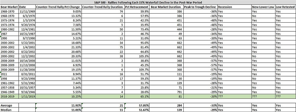
“What do these data say about the current counter-trend rally?
First, this rally has already retraced 65% of the waterfall decline (greater than average and median) and has lasted about three weeks (less than average but greater than median). This suggests upside from here may be limited in both magnitude and duration.
Furthermore, these data strongly suggest the major index will retest the Christmas Eve low at the very least and most likely will make a new lower low in the weeks and months ahead.
While we are not forecasting a recession at this time, waterfall declines of the magnitude just witnessed tend to take place in recessionary market environments, so we need to at least be open to that possibility.
Finally, waterfall declines typically take place in bear markets lasting an average of 284 days (median 139 days). At just 81 days in duration, these data suggests we have bit further to run before we reach the bear market nadir. That said, there are four instances of waterfall declines taking place in short bear markets, so we don’t place much weight on this particular piece.”
From Carl Swenlin of Stockcharts.com, “One of my favorite chart patterns is the wedge. Rising or falling, they arrive frequently and usually resolve predictably. On this chart there happen to be two rising wedge formations. The first one led us into the bull market top in September/October of 2018. It resolved downward, as expected, but I have to admit that the massive downside follow through was atypical to say the least. The current rising wedge off the December low should also resolve downward. That is not guaranteed, but, since we're in a bear market, it is more likely. Once it breaks down, the "prediction" is fulfilled, and I am not aware of any rule-of-thumb techniques to project how far down price is likely to go, but, again, the bear market implies that there will be more downside.”

Lance Roberts of Real Investment Advice has been a little less sanguine than many of his peers. “After a record-breaking number of positive months in 2017 with extremely low volatility; 2018 was a year where volatility returned as prices consolidated in a very broad range. Notice there was important price support being built by the markets by repeatedly testing price levels over time before giving way.”

““So…is the bear market over OR is it just starting?” The honest answer is “I don’t know.” But, anything is certainly possible. However, a look back through history at previous “bear market beginnings” can certainly give us some things to consider.
1974
After two previous bear market declines, as I discussed just recently with respect to “Secular Bear Markets,” the S&P 500 broke out to all-time highs convincing the “bulls” the worse was over.
It wasn’t.
Over the next several months the markets continued in volatile trade, retesting support several times before breaking down.”

“But, at this point, it was still believed just to be a correction. The change occurred when the market rallied, and failed, at the previously broken support line. That “failure point” marked the beginning of the “1974 Bear Market.”
1999
After the “Long-Term Capital Management” and the “Asian Contagion,” the market regained its footing and began a rampant run to all-time highs in 1999. The bulls were clearly in charge, and despite concerns of “Y2K,” stocks continued to press new highs.
While Jim Cramer was busy publishing his list of the “Top 10 Stocks For The Next Decade,” the market begin to struggle to make new highs as volatility rose.
The early decline from “all-time highs” was only considered a correction as the demand by the bulls to “buy the dip” rang out loudly.”

“In early 2001, the market broke the support line that had contained the market over the last 24-months. Not to worry, it was simply just part of the “correction process” and many commentators on CNBC at the time were suggesting it was a “buying opportunity.”
It wasn’t.
The market rallied back, and failed, at the previously broken support line. That point marked the end of the topping process and the beginning of the “Dot.com Crash.”
2007
In 2006, the market was rallying as “real estate” was going wild across the country. Firms were hocking every type of exotic mortgage derivative they could find, leverage being laid on without concern, and pension funds were being pitched “high yield” opportunities.
As the market broke out to new highs, there was little concern as there was “no recession in sight,” “subprime mortgages were contained,” and it was a “Goldilocks economy.”
Over the next year the market repeatedly hit new highs. Each new high was followed by a decline which tested broadening support giving the bulls repeated opportunities to call for “dip buying.”
It was believed the year-long consolidation process was simply the “set up” for the continuation of the bull market.”

“In early 2008, the running support line was broken as “Bear Stearns” failed sending off alarm bells to which few listened. The market rallied backed, and failed, at the previously broken support line.
That point marked the end of the topping process and the real beginning of the “Financial Crisis.”
By now, you should realize the similarities between all of these previous market tops and what is happening currently.”
On The Fat Pitch blog site, they put together some very thorough research regarding the extreme volatility that we have been seeing. They note, “When SPX drops 15-20% or more, it has a strong tendency to retest those lows in the weeks/months ahead. Since 1980, there have been at least 10 of these periods and all but two formed a base at the low (i.e., a low retest) before moving higher (yellow highlights). The two exceptions (1982 and 2009) are hard to compare to the present as SPX fell 27% and 57% over 21 and 17 months, respectively. Momentum normally takes time to be reversed and the current drop is barely 3 months old.”

“Similarly, SPX had four one standard deviation down days into Christmas Eve followed by a four standard deviation up day on December 26. That has only happened 3 times before, in 1962, 2002 and 2015 (a small sample). One year forward returns were very good but the low was retested in the months ahead each time (from NDR).”

Volatility
This type of volatility is typical at the start of bear markets. From @OddStats:

From Sentiment Trader, “The VIX “fear gauge” has dropped dramatically as options traders price in a much reduced level of volatility going forward. But the S&P 500’s actual volatility remains high.”

“The spread between the two is now among the widest since 1990, and other times it got this wide, stocks mostly struggled going forward.”
Volume is Missing
From Stockcharts.com, “This rally has surprised many, but not technicians. We were extremely oversold at the recent bottom with a Volatility Index ($VIX) reading at 36. History tells us that a rally was in store and that's what we've seen. However, volume trends are extremely poor and the weekly PPO shows the sellers remain in control of momentum, despite the recent strength.”

On Dana Lyons Tumblr he notes, “While the volatility market isn’t necessarily one of the “risk indicators” that we track, it certainly can be useful in gauging appropriate risk. Presently, the S&P 500 Volatility Index, or VIX, is testing what may be key support near 20 in the form of the 61.8% Fibonacci Retracement of its August-December rise (stock volatility expectations generally move opposite price).”

Lack of Conviction
John Murphy from Stockcharts.com has pointed out that investors have been rotating into bonds over equities (a bearish event). “After jumping to the highest level in more than a year during the fourth quarter, the bond/stock ratio pulled back during January (as stock prices rebouded). The ratio has pulled back to its highs formed during last February and April which could provide new support. That would suggest that the January stock rebound may be nearing completion. The fact that bond yields haven't followed stocks higher this month suggests that bond investors remain skeptical of the stock rebound. The recent upturn in the bond/stock ratio is the biggest in three years before the last upleg of the nearly ten-year bull market in stocks began. Which means that it shouldn't be taken lightly. Given the age of the bull market, any signs of a major shift in asset allocation preferences needs to be taken more seriously.”

“Chart 2 compares the performance of the major bond categories over the past quarter. Bond ETF symbols are shown on the top left of the chart. Treasuries are in the lead. That includes the 20-Year Treasury Bond iShares (black line), and the 7-10 Year Treasury iShares (blue line). The rising red line shows Investment Grade Corporate Bond iShares (LQD) lagging behind. The green line is the weakest of the four and represents High Yield Corporate Bond iShares (HYG). The fact that Treasuries are doing better than corporate bonds also shows that investors are in a defensive mood. In a strong economy, investors normally favor corporate bonds over Treasuries. In a weakening economy, they favor safer Treasuries over corporates. To go a step further, the fact the investment grade corporate bonds (red line) are outperforming high yield (or junk) bonds (green line) is another sign of caution. High yields bonds are more closely tied to the stock market, and usually lead on the upside when stocks (and the economy) are strong. The fact that high yield bonds are lagging behind Treasuries and investment grade corporates is another sign that investors are favoring safer bond categories over riskier ones more closely tied to the economy and the stock market.”

When I look at the year-over-year change in the spread between high-yield and investment grade bonds, in the past, there have been market bottoms when the y-o-y change in spreads gets north of 60%. We’re near 40% currently so we could see another move lower before the ultimate bottom is established.

This rotation into bonds is evident from institutional positioning numbers out of BAML. From Business Insider, “A recent Bank of America Merrill Lynch survey of 243 fund managers overseeing nearly $700 billion found that bonds allocations grew by 23 percentage points over the past week. That's the biggest increase on record.
Those investors reduced holdings in stocks by 15 percentage points over the same period, according to the data.”

“The shift highlights the risk-averse sentiment that's pervaded the investing landscape in recent months, as equities have suffered a series of painful pullbacks. It also matches BAML data from last week that showed traders pulled a whopping $27.6 billion out of stocks in the week ended Dec. 12, the second-biggest outflow of all time. On a global basis, a record $39 billion was yanked from stocks worldwide over the same period.
These developments have pushed the market close to "extreme bearishness," strategists at BAML wrote in a client note. And that sentiment is being at least partially fueled by dismal expectations for continued economic growth.”
Looking at this chart from Stockcharts.com we can see that the 30-year treasury yield attempted to break out but failed. This is indicative of treasury demand and coincides with our views that investors are seeking safe haven protection within their portfolio.

The bounce from the Christmas Eve low was a powerful reflex rally. What was a little disappointing was the leadership role off the low. Looking at sector performance, defensive sectors had led the market higher as seen in the Relative Rotation Graph. We find it hard to imagine the ultimate lows have been set until we see clear leadership from cyclical sectors. The leaders to date have been Utilities and Real Estate while Consumer Staples and Health Care were leaders and are now trailing off.

Our cyclical vs. defensive sector comparison confirms the market leadership view.

Final Thoughts
We are positioning our portfolio by fading the current rally and hedging our core holdings. We are waiting for a pullback in the market (possibly a re-test of the December lows) Once we get to that level, we will deploy capital into the names that are offering meaningful value as per our metrics. We believe at that point the market will have priced in an economic slowdown and an earnings recession. Looking at the chart below (via Humble Student of the Markets), the recent decline in the market is factoring in a fairly bleak outlook in our opinion. As Cam Hui writes in the note, “US equity prices had already fallen about 20% on a peak-to-trough basis, and the historical evidence indicates that such a decline is already discounting a mild recession. How much worse can it get?”

We’ll be monitoring several market data points on the look-out for evidence of a much more severe economic outlook that would warrant further price declines beyond what was reached in December. A major recession would be the catalyst for such action. Unless our metrics change dramatically, we’ll be positioning under the assumption that no such major economic recession materializes.
Joseph S. Kalinowski, CFA
Comments